Tuesday, April 20, 2010

Vincent van Gogh Self-Portrait

Van Gogh, Self Portrait, 1889, NGA
Although Vincent van Gogh’s painting of himself, titled Self Portrait, 1889, located in the National Gallery of Art, was not painted outdoors, the use of dabs of pure color and emphasis on light are characteristics of Impressionist painters. Around his head and upper body, thick textured brushstrokes create a circular motion. The background color is a similar shade as the blue in his shirt. From far away, the background and shirt seem to blend together. The different brushstrokes used separate the shirt from the background because the strokes within the shirt are long and wavelike. As the eye comes closer to the painting, it is clear that Van Gogh does not use just one color. He blends together different shades of blue, green, black and white to form his vibrant strokes. The white emphasizes the seam in Van Gogh’s right shoulder because it is lighter than the other colors. The painting’s back left is a little greener, showing the reflection of light across the canvas.

In his self-portrait, Vincent van Gogh uses brushstroke and color to express a gloomy emotion. His face appears gaunt, and his blue eyes are vacant. There is no emotion coming from his face; he is blank. By using formal qualities to express emotion, rather than the subject, Van Gogh seems disconnected from the viewer. Even though his face is turned left, looking out at the audience, he avoids direct eye contact. His furrowed brows and tight lips show that there is something on his mind. The tension in his face is further emphasized by expressive brushstrokes because they look like wrinkles. His face has a greenish hue, contrasting with his red hair, perhaps indicating that something is not right. The dominant use of blue also adds to the painting’s sad, emotional tone. The formal characteristics of the painting seem to relate to Van Gogh as a person. He was mentally unstable, famous for cutting off his ear and sending it to a woman. The thick, curvilinear brushstrokes and blue coloring of his self-portrait show how he used color and line to express his instability.
*Picture: http://www.nga.gov/education/classroom/self_portraits/bio_van_gogh.shtm

Paul Gauguin Self-Portrait: Compare and Contrast with Van Gogh’s

Gauguin, Self Portrait, 1889, NGA
In contrast to Van Gogh’s self-portrait, Paul Gauguin’s self-portrait, also painted in 1889 and titled Self Portrait, uses bright colors and playful objects, making a traditional subject, like a self-portrait, untraditional. Even though both artists use the same medium, oil, they represent themselves in different ways, showcasing their individual painting styles. While Van Gogh primarily uses brushstroke and color to express a forlorn emotion, Gauguin’s self portrait is more colorful and whimsical, showing his confidence in his painting and himself. By not portraying himself as realistically as Van Gogh, Gauguin breaks away from the traditional self-portraits of the past. His painting style is more lively, showing that he does not take himself as seriously especially with the addition of the halo over his head.

Unlike Van Gogh, who paints part of his upper body and his head, Gauguin’s head pops over a yellow object representing his torso, contrasting with the painting’s bright red background. Behind the right side of his head, a branch with apples hangs. Perhaps these apples above Gauguin symbolize temptation, relating to the biblical story of Adam and Eve. Unlike Adam and Eve, he seems unaffected by the fruit as he looks away. Gauguin has not yet been seduced by the snake in his palm because he still has his halo. The setup of these two apples is similar to a stem of two cherries, rather than an apple tree. The usage of fruit serves as an abstract connection to nature. In addition, the flat planes of color and strong outlines seen in this painting are characteristics of synthetism, a style that emerges after Impressionism.

Despite their stylistic differences, the strong association between Gauguin and Van Gogh is illuminated through their paintings’ location and similar methods of display. In the National Gallery of Art, the two self-portraits frame the sides of an archway. Gauguin’s painting is on the left while Van Gogh’s is on the right. The room the paintings are in is primarily filled with Gauguin’s work, along with a few of Van Gogh’s paintings as well. The works are hung similarly, both in ornate gold frames relatively low on the wall. Despite their complementary ways of being displayed, Gauguin’s painting seems to overshadow Van Gogh’s because more people stopped and looked at it. This could be attributed to things like size and color especially its vivid palette of yellows, reds and greens. Gauguin’s painting is larger and brighter while Van Gogh’s painting seems to blend in more with the neutral walls of the gallery. Because Van Gogh’s painting is less dynamic than Gauguin’s, it would be difficult to make it standout because of its somber colors. Without the archway separating the two paintings, Van Gogh’s painting would have been overshadowed even more.
*Picture: http://www.nga.gov/collection/gallery/gg82/gg82-46625.html

The Sublime and Frederic Edwin Church

Church, Niagara Falls, 1857, Corcoran
Frederic Edwin Church’s Niagara Falls is located in the Corcoran Gallery of Art. Completed in 1857, this painting is a massive and realistic representation of one of North America’s natural wonders—Niagara Falls. Up close, the exquisite detail used by Church shows that this piece could only be painted after one actually experiences the falls. Similar to the technique used by the Pre-Raphaelite Brotherhood, every detail on the immense canvas has been treated equally because each part of the painting is important and adds to the powerful experience of the falls. From the blue pink mist coming up from the falls to the textured white caps of the water’s waves, every detail has been captured. Perhaps the emphasis on all aspects of the painting reflects the belief that Americans had been chosen to settle in this country. In addition, it further illustrates the power of the falls and how they should be preserved. This was a concern of Church’s, and as a result, he met with Canadian government officials to talk about the possibility of turning the area into a national park so that it could be protected.[1]

Church’s depiction of the falls emphasizes their sublimity. Although he is an American painter, instead of painting the American Falls, he decided to paint the Horseshoe Falls, located in Canada, because they are considerably larger.[2] As a result, his painting is more impressive and sublime than previous representations of the subject because he chose to paint the most monumental fall. Through his painting, the viewer is able to see the greatness of the falls without actually experiencing any danger because they are positioned in a way that makes them feel like they are about to fall in. Everything in the painting seems to go towards the approaching drop of the falls. In the bottom left, a tree branch hovers near the edge. This drop is large, and many people have died attempting to go over the falls. The danger that lies in the powerful drop combined with the painting’s large size truly makes this a sublime subject. Edmund Burke’s treatise on the sublime, from 1757, creates another category of art for things that are neither beautiful nor ugly. The sublime is a term reserved for art that goes beyond these categories like Church’s Niagara Falls, as the viewer is able to experience the greatness of the subject without actually being there.
*Picture: http://www.corcoran.org/collection/highlights_main_results.asp?ID=51

The Range of Emotions Seen at a Funeral

Courbet, Funeral at Ornans, 1849-1850, d'Orsay

At funerals, one witnesses a wide range of emotions. Obviously, the predominant emotion is grief as death is a terrible thing. Nonetheless, despite the sadness surrounding funerals, not everyone mourns. The varying emotions experienced by people at a simple country funeral are seen in Gustave Courbet’s Funeral at Ornans, located in the Musée d’Orsay. Painted in 1849-50 and showcased at the Salon from 1850-1851, his massive painting is more about the individual portraits of the mourners than the dead person and the ceremony itself. Although the funeral appears to be an ordinary funeral for an average person, Courbet pays great attention to individual detail. At the painting’s forefront, a hole is being dug for a grave. Nonetheless, this is not the central focus of the painting because it is just a small detail within a larger group of details—the people attending the funeral. Behind the grave, funeral goers are arranged in a horizontal line with each person treated similarly because no central character is emphasized over the others. The painting’s landscape is somewhat barren and dreary, further adding to the emphasis on the mourners.

Despite the darkness of the painting, Courbet uses enough detail to identify individuals and their actions. By looking at the painting, the viewer can see the separate experiences people are having because everyone seems to be doing something different. For example, to the left of the priest, the alter server behind the central alter boy is clearly distracted as he is looking up at the man with the hat next to him. He probably did not know the dead person and is only at the funeral to complete his job as an altar boy. As a result, he feels no ties to the deceased being mourned and is probably bored. Another character towards the center of the crowd is the man behind the man with the green socks. He is looking down at the ground, lost in thought. Perhaps he was a friend of the departed and is reflecting on their relationship or on death itself. The painting’s right corner is made up of women who are all dressed in a sea of black. Some women appear to be talking as they face away from the grave while others are lost in their emotions, crying into white handkerchiefs. The detail that Courbet infuses each character with give clues about the identity of the person because these depictions are clearly individual portraits.
*Picture: http://www.musee-orsay.fr/en/collections/works-in-focus/search.html?no_cache=1&zoom=1&tx_damzoom_pi1%5BshowUid%5D=2395

Monday, April 19, 2010

Renoir at the Musée d’Orsay

Renoir, Bal du Moulin de la Galette, 1876, d'Orsay
At the Musée d’Orsay, there are two paintings by Pierre-Auguste Renoir that depict people dancing. His earlier work, Bal du Moulin de la Galette, 1876, is a leisure scene filled with people and activity. Despite the busy nature of the painting, Renoir is still able to infuse it with sweet little details like the chandeliers hanging above and the little girl’s blue bow located on the painting’s left side. The people towards the front of the painting are the most individualized because they are the closest. Although they seem oblivious to the fact that they are being watched, the viewer does not feel intrusive because the figures appear to be too caught up in what they are doing to notice. No one is looking directly at the viewer. One person is seen writing, representative of the French bohemian culture of the time, while the backs of the others are turned away. As the eye travels further back into the work’s background, people become more anonymous and less detailed. Since there are so many people, figures turn into brushstrokes and dots on the canvas. Instead of the painting’s focus being on the characters, Renoir plays with light to create a sense of movement. Dashes of light combined with pink and blue shadows convey the idea of music and motion. Although the viewer cannot see any musicians, they know that there must be music playing.

Renoir, Danse à la Campagne, 1883, d'Orsay
In contrast, Renoir’s later painting, Danse à la Campagne, 1883, Musée d’Orsay, is more intimate and individualized. There is less of an emphasis on light, and the brushstrokes used are less frantic than in his other work. In addition, the colors appear to be smoother and not as textured. In this painting, Renoir captures a private moment shared between two people. The figures have just finished a meal, evident from the messy tablecloth and used utensils in the painting’s right corner. Instead of worrying about cleaning up dinner, the characters are more concerned about enjoying the moment. The man is relishing his companion so much that he does not notice that he has lost his hat while dancing. His yellow straw hat has fallen, towards the work’s right corner. To the left of the man, a face is seen looking up at the figures. Although the couple does not realize it, they are being watched from both directions—the anonymous face peaking in from behind them and by the viewers looking directly at the painting. Perhaps Renoir is making a statement about privacy and how even though one might think that one is alone, someone is always watching. As a result, it is impossible to escape the gaze of others.
*Picture of Bal du Moulin: http://www.musee-orsay.fr/en/collections/works-in-focus/search.html?no_cache=1&zoom=1&tx_damzoom_pi1%5BshowUid%5D=4038
*Picture of Danse: http://www.musee-orsay.fr/en/collections/works-in-focus/search.html?no_cache=1&zoom=1&tx_damzoom_pi1%5BshowUid%5D=108820

Orientalism in the Paintings of Eugène Delacroix


Delacroix, Death of Sardanapalus, 1826, Louvre
The same room that holds Géricault’s Raft of the Medusa at the Musée du Louvre also contains three paintings by the French painter Eugène Delacroix. In each of these paintings, oriental influences are seen. His most exotic work is Death of Sardanapalus, 1826, which is based on a poem by Lord Byron. In this poem, a horrible Assyrian leader, Sardanapalus, refuses to accept defeat. Instead, he watches as all his belongings, including humans, are destroyed. There is a sense of the exotic with the hookah in the right corner and the ivory elephant head with precious stones placed at the base of Sardanapalus’s bed. It is clear that this scene does not take place in Europe. Within the painting, Delacroix emphasizes the amount of material possessions that the ruler has through lavish details and rich colors. His concubines are adorned with beautiful jewels. One has a ring on every finger while even the horse is wearing an elaborate bejeweled bridle. Within the painting, the two primary colors used are gold and red, alluding to the wealth displayed in the painting. Despite its decadence, the work depicts a gruesome image with the slaughtering of the concubines. These women are being brutally murdered while their leader does nothing. As the bodies of his women begin to fall, Sardanapalus remains emotionless, unaffected by the violence caused by his actions.
Delacroix, Massacre at Chios, 1822-24, Louvre

Although Delacroix’s Massacre at Chios, 1822-1824, located in the Musée du Louvre, also depicts the slaying of a group of people from the Orient, this painting is not as exotic as The Death of Sardanapalus because it is not as extravagant. The people within the work are not adorned in jewels. Instead, they are common people, barefoot and wearing rags. Nonetheless, the scene is just as disturbing as the previous image. In the painting’s bottom right corner, a young woman has just been killed while her baby still clings to her breast. Although the central figure in the painting is a man, the majority of the dead are helpless women of all ages. It is interesting to note that in the other painting, women are also the ones being killed.

Delacroix’s focus on Oriental women is seen in another one of his works at the Musée du Louvre, Women of Algiers, 1834. In this painting, three Middle Eastern women are seen lounging in their harem. Although they are not being harmed like the other women depicted, they are unable to control their surroundings because they cannot avoid the gaze of the viewer. Exotic details similar to those used in The Death of Sardanapalus are seen, making it obvious that this scene does not take place in Europe. As a result, it becomes acceptable to objectify and look at these women without their permission because they are not European.
Delacroix, Women of Algiers, 1834, Louvre
*Picture of Women of Algiers: http://www.louvre.fr/llv/activite/detail_parcours.jspCURRENT_LLV_PARCOURS%3C%3Ecnt_id=10134198673389836&CONTENT%3C%3Ecnt_id=10134198673390014&CURRENT_LLV_CHEMINEMENT%3C%3Ecnt_id=10134198673390014&bmLocale=en

Raft of the Medusa

Géricault, Raft of the Medusa, 1818-1819
In Théodore Géricault’s massive painting, Raft of the Medusa, at the Musée du Louvre, the colors used contribute to the work's dramatic subject. The somber palette relates to the horrible scene depicted. The dead men are very realistic with purple and gray hues used to make their faces seem completely lifeless. In addition, color creates a contrast between the painting’s left corner and right side. On the left, there is a dark cloud and a huge wave that is on the verge of crashing over the raft. To me, this corner was representative of death since nature’s power is the obstacle preventing the people on the raft from living. In contrast, the right side may symbolize life because there is a hint of yellow sky. This light is what the slave is reaching up towards, relating to his hope for survival. When I was going back through my pictures, I was surprised to see that the colors I saw in person did not translate well in photos. Since the painting is dark, it is best seen in person over a slide. In a slide, crucial details are lost like the textured whitecaps of the water and the color contrast between the white men and the black slaves.
Géricault's grave, Père Lachaise Cemetery

Since color is such an important aspect of the painting, it is interesting to see a version that is devoid of color. Théodore Géricault thought his best work was the Raft of the Medusa, 1818-1819. Nonetheless, I was quite surprised to see the Raft of the Medusa depicted on his tomb at Père Lachaise Cemetery in Paris. It is obvious that this controversial work is what Géricault wanted to be remembered by as it is immortalized with his body forever. His original painting is turned into a low relief, shown on the front of his tomb. It is interesting to see a smaller version of the work because although the copy is good, its overall dramatic affect is not as powerful as the original painting. Even though the tomb is bronze, the lack of color is not the relief’s primary problem. There are too many characters represented in such a small space. The viewer is unable to see what everyone is doing because there is too much going on. As a result, the emotional moment that the relief depicts is lost. On top of the tomb, Géricault is shown sprawled out wearing a long draped cloth. He is represented as the quintessential Romantic artist with his little hat, moustache, brush and palette. As he looks away into the distance, he appears to be taking a quick break from painting his masterpiece.

Musée de l’Orangerie

Monet, Les Nymphéas, 1918-1926, l'Orangerie
Although I often overlook how a painting is presented, the way a piece of art is displayed can affect how the viewer sees it. At the Musée de l’Organgerie, Claude Monet’s water lilies, Les Nymphéas, are exhibited in an unconventional way. The large paintings mold with the curving of the walls since the two rooms that the works are displayed in are ovals. These stark rooms create a contrast between the white walls and the bright paintings. In addition, only natural light is used in the exhibit, coming down from the ceiling’s singular skylight. The skylight is also oval shaped, mirroring the shape of the rooms. Fluctuations in natural light affect how the viewer sees the paintings. The day I visited the museum was somewhat cloudy. As a result, when I was in the exhibit, I could see how the artwork changed from when it was sunny outside to when it became cloudy especially in relation to the colors used. Since these paintings were made en plein air, I think that Monet would have wanted people to see his work without artificial light in order for the viewer to have a better sense of how the lilies looked in nature.

In addition, where the viewer stands in relation to the paintings also affects how one sees the art. Within the galleries, there is a long bench for people to sit on while looking at the works. The location of these benches is crucial for viewing the paintings because the onlooker is further away from the canvas. From this perspective, the paintings’ subject is quite obvious. When the viewer gets closer, the images become more abstract. As I approached one of the paintings, the subject became unclear. I lost what I was seeing because to me, the painting was no longer water lilies but a solid background with pastel colors swirled all over the canvas. Although he used oils, the texture of the paint made it seem like Monet used crayons because some of the strokes are somewhat waxy. The swirls of color mixed on the canvas are characteristics of Impressionism, a movement that Monet was part of. If I had stayed on the bench, I would have never noticed the differences in how one can see a work of art depending on their location.

In my opinion, the most remarkable thing about the Musée de l’Orangerie is the tranquil setting created by the combination of the gallery with Les Nymphéas themselves. The peaceful environment of the exhibit correlates with the purpose of the works. Monet gave these paintings to French president, Georges Clemenceau, immediately after the end of WWI, as a tribute to peace.[1] These works acknowledge two different types of peace—the peace that ended WWI and the inner peace inside of people. If the paintings were displayed in a more elaborate setting, they would be overwhelmed, losing a part of their overall beauty and the calming affect that they create.

Musée Rodin


Rodin, The Kiss, 1888-1889, Rodin Museum
The Musée Rodin was my favorite museum I visited in Paris because of its small intimate setting and beautiful gardens. It did not have the formal atmosphere that most museums usually have. This could be attributed to the building’s original function. The Hôtel Biron, where Rodin resided, was transformed into a museum dedicated to Rodin’s works after his death. Because it is the place where Rodin lived, his works seem to naturally fit in with their surroundings. When you enter the museum, it still has signs of its original function with its large windows and staircase. Throughout the museum’s gardens, Rodin's works are dispersed such as his famous sculpture, The Thinker. Despite being placed outdoors, there is a contrast between the rough texture of his sculptures and the well-groomed shrubbery that surrounds it. Nonetheless, due to the large size of the sculptures, they are better suited outdoors instead of inside the museum's cozy interior.


The most striking aspect of Rodin’s sculptures is their ability to project emotion through their bodies. His marble work, The Kiss, 1888-1889, captures a kiss between two nude lovers. Although the use of nude statues is a classical technique, the passion between the two people creates a stronger emotion than works from an earlier time. As a viewer, I almost felt like I was intruding on the sculpture’s space because the people are so immersed into each other and their actions. Since the two figures have closed eyes,
they do not notice that they are being watched. In my opinion, this sculpture is more about capturing an eternal expression of love than the people being represented. They are not individuals because they have no clear features, and their faces are hard to see. As I walked around the sculpture, the two figures seem to almost become one. Parts of their bodies are joined together such as the woman’s leg on the man’s thigh. As a result, it is hard to view the characters in the work as separate beings because of the execution of the action portrayed.

Sunday, March 28, 2010

Turner to Cezanne: Masterpieces from the Davies Collection

The Corcoran Gallery of Art is currently holding an exhibition called “Turner to Cezanne: Masterpieces from the Davies Collection.” The Davies sisters were two British art collectors who accumulated a large number of European works from the mid 19th century to the early 20th century. Despite acquiring works over a fifty-year span, there is a similar theme seen throughout their collection because the subjects of their art are either landscapes or intimate portraits. There are no modern scenes of everyday city life. As a result, I was able to see how landscape paintings and portraiture developed throughout time in England and France because the exhibit was arranged chronologically by style.
Turner, The Storm, 1840-1845, Corcoran

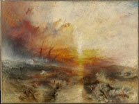
Due to their British heritage, the sisters first focused on collecting British artwork in order to enhance cultural life within England. The British painter Joseph Mallord William Turner was the first artist showcased in the exhibit. His work, The Storm, painted in 1840-1845, reminded me of another work of his, The Slave Ship. Painted at the same time, around the end of Turner’s career, both seascapes deal with nature and the sublime. Although the two paintings have different color palettes, the painting technique is similar
Turner, Slave Ship, 1840, MFA Boston
with the use of rapid brushstroke and impasto. Both images are more abstract especially the
ships seen in their backgrounds. In addition, the remains of the ship’s sails in The Storm are reminiscent of the slave’s hands as both emerge from the angry waves. As the boat is destroyed by the forceful waves, there is an emphasis on the power of nature in The Storm. Nonetheless, in person, the painting is very small and some of the affect is lost on the viewer.

Millet, The Good Samaritan, 1846, Corcoran
As the Davies sisters grew older, their tastes developed and became more modern. They began to favor realist works of French artists like Jean-François Millet over the English landscapes of Turner. Millet’s painting, The Good Samaritan, painted in 1846, represents a simplified and more modern version of a biblical narrative. He takes a biblical reference, the good Samaritan, and applies it to the French working class. A man is shown carrying another man but from their wardrobes, these men are clearly members of lower French society. Despite their tough living conditions, the men are still able to stop and help each other. The characters are not individualized as the viewer can only see their backs. In addition, the background is simplified with no clear horizon line. As a result, this painting become a depiction of an anonymous action. The lack of embellishment in Millet’s works is characteristic of French realist art. Although the Davies sisters did not buy art that reflected city life, realist works allowed contemporary political messages to be reflected through art that also suited their taste.

*Picture of Slave Ship: http://www.mfa.org/collections/search_art.asp?recview=true&id=31102
*Picture of The Good Samaritan: http://www.jeanmillet.org/The-Good-Samaritan,-1846.html